This article will give a brief overview of how to view and analyse your energy consumption in the Smappee dashboard. The article will briefly go over the live values, our graphs and table and how to configure them.
Live values
There are 2 cards in the dashboard which can show us live values, the cards: 'Live values' and 'Live electricity values'.
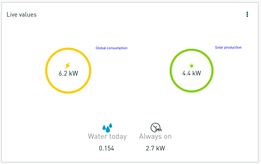
Live values
This card shows us the bubbles with the global electricity consumption, solar production and when using a Gas & Water monitor also Water & Gas usage. The card will also display the always on power consumption which is the lowest measured consumption in the last 24 hours. There is no extra configuration for this card so it should look similar to the screenshot below.
Live electricity values
This card shows the live values of all the measurement and possible your sub measurements. There is plenty which can be configured here. You access the settings by pressing the 3 dots as indicated in the screenshot.
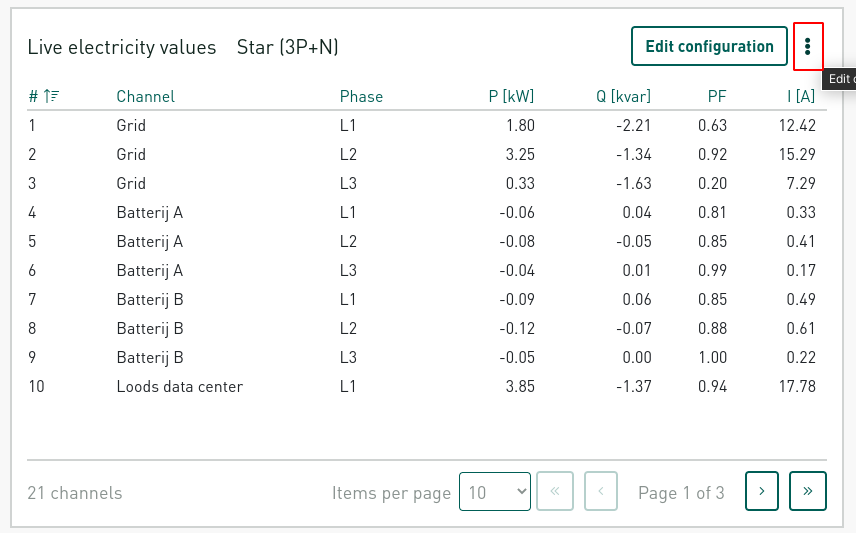
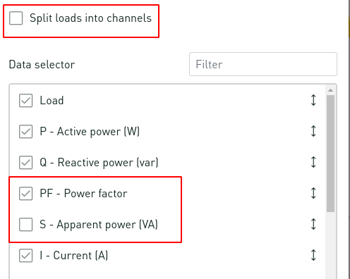
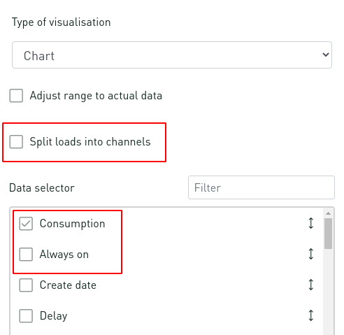
There you can select which data to show in columns as well select or deselect the option to split the loads into channels. Splitting the loads in to their separate channels just means you can see the data for the different phases L1, L2, L3 if you have a 3 phase grid.
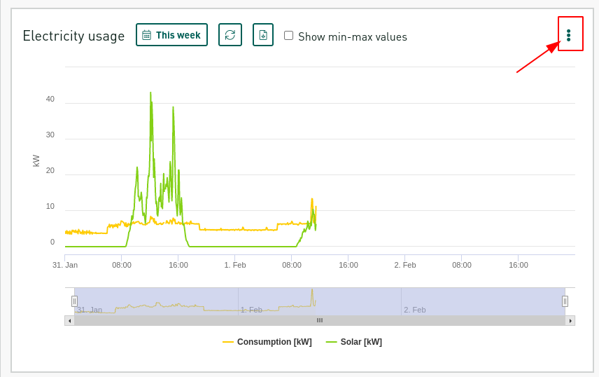
Electricity usage: Graph
The electricity usage card shows you the historic data for your location. You can also configure this card similar to the Live electricity values card by pressing the 3 dots in the top right corner as indicated in the screenshot.
With this menu you can choose to change the visualisation of the card to either the Graph which is discussed here or the Table which is discussed below.
The rest of the configuration is similar to the Live electricity values card. You can select which data to show in columns as well select or deselect the option to split the loads into channels. Splitting the loads in to their separate channels just means you can see the data for the different phases L1, L2, L3 if you have a 3 phase grid.
Finally, you can also change the interval and the period of the data to be shown by pressing the button which is indicated in the screenshot below. 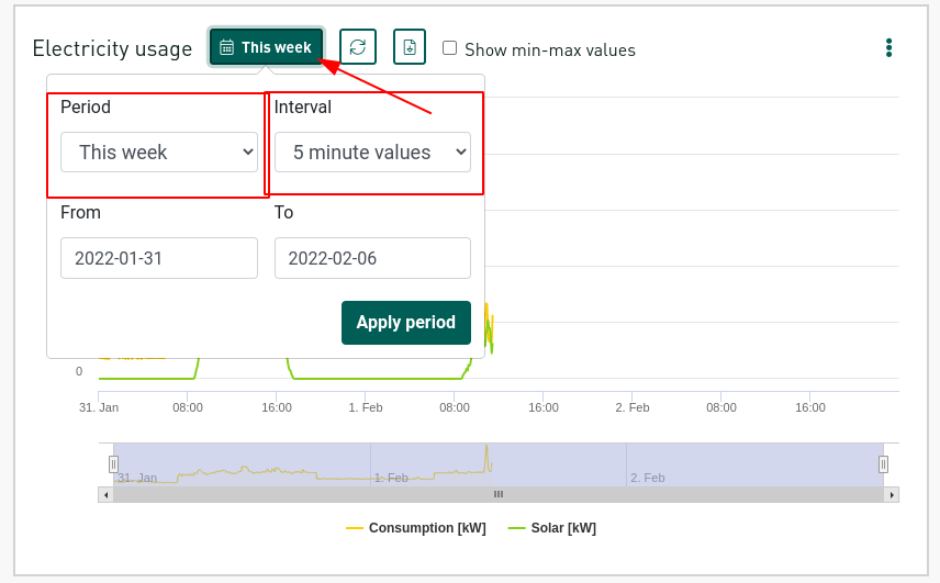
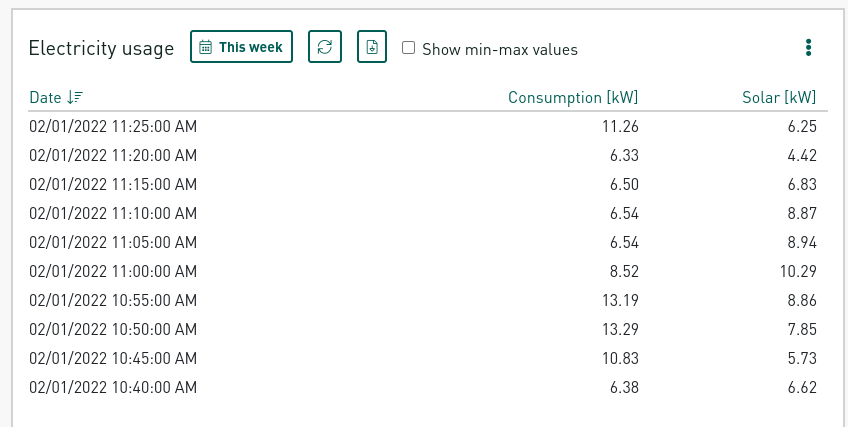
Table
The Table view's configuration is exactly the same as the Graph. You can swap to the Table view by setting the Type of visualisation to Table as indicated in the screenshot.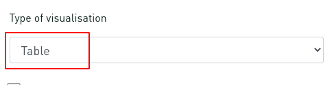
Your table should look something like the screenshot below. Showing your consumption in numbers for the selected intervals during the selected period.